ShopDreamUp AI ArtDreamUp
Deviation Actions


Badge Awards
Description
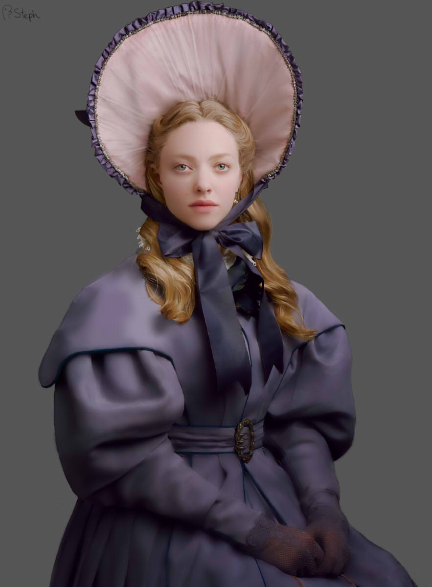
Ah, it's good to have this finished. This is Amanda Seyfried as Cosette Fauchelevent in Les Misérables 2012 and this is based on a picture in Vogue magazine I own (I saw it and thought 'I wonder if I can draw that'). This was created on Paint Tool Sai using my previous line version as a base. This was done in around 45 hours (including the line version) with most of that spent doing nearly every strand of hair individually.
Line version: [link]
Other Les Mis Paintings:
Javert in Colour: [link]
Fantine in Colour: [link]
Line version: [link]
Other Les Mis Paintings:
Javert in Colour: [link]
Fantine in Colour: [link]
Image size
883x1200px 71.27 KB
© 2013 - 2024 Tall-Dwarf22
Comments19
Join the community to add your comment. Already a deviant? Log In
Firstly, I have to say this is very well done. I had to look up the original just to see what I was comparing it too and you did an amazing job mimicking this photograph.
The hours you devoted definitely paid off in a big way.
Secondly, while you did an amazing job, I did find some areas in which you could improve upon, that is to say when comparing it to the original photo (I'm assuming your looking to make this piece as real as possible...?). Though they were hard to see at first, I did eventually find them after a while. (Not kidding, this is seriously good!)
I'll start at the top and try to work my way down the picture. I noticed that the bonnet and most of the clothing in general had great shadows to show the ripples and folds, but some of them weren't dark enough were they should have been.
Some spots that popped out (aside from the bonnet) were the belt and inner left arm (it seems to sort of stop at the bicep). The ribbon was actually very well done I thought, with possibly just a few areas needing a darker shadow. As for the cloth itself, it seems a bit too smooth, for the bonnet and the dress. You can't see the raw texture of the material that was used for the costume.
As for her face, again, great job, but in the photo, she looked more tired and rough. Her eyes carried a weight to them while still being even a bit more open, awake. Here, she looks a little sedated and/or passive. The colour on her face could have been a bit more bolder as well. Her eyebrows are a bit light, her lips a bit paler, and again like the details in the cloth, her face is missing the distinctive creases.
While you did get the lighting well, it is a bit heavy in some areas, and I think that's what's keeping this piece back from being that much more better. You have the shading but not enough, and you have the lighting, but it's too much.
I'm also noticing her gloves are a little too purple, they suffocate the natural skin colour a bit too much, and again, it could use a bit more shading too it.
Now as for the big thing, her hair. You spent a lot of time on it and it definitely paid off. Aside from not getting every single, tiny stray strand, I can't see anything wrong with it. I even thought at first that the tip of the right length coming over her shoulder ended a bit blurry or strange, but when I saw the photo, you merely copied the awkwardness of that tip as it is present in the photo. Even the grey hairs on the top of her head, you matched those perfectly.
And while you did have perhaps a tad too much light you still copied the large shading change the piece takes from just below her shoulder to the bottom, where it is all just a slight shade darker than the upper half.
Even the placement of everything, the exact flow of the ribbon, the creases that are present in the clothing and bonnet, the curves in her ears (not to mention the strands of hairs, again) - it's all where it should be.
You should be very proud of this piece. It is an incredible piece of art and you did a great job!
Vision - Since It was obvious you were trying to copy it, even though it wasn't original, you did a great job - 4 stars
Originality - Copied a photo, so ... - 1 star
Technique - For a digital art piece, I'd say this is pretty damn good (especially sine at first I thought it WAS a picture) - 4 stars
Impact - I'm basing this on comparison to the photo - and like I mentioned - if the balance was met between that extra amount of shadow that was needed and pulling back on the lighting, it would have helped make this that much closer to being identical - 4.5 stars